Case Studies
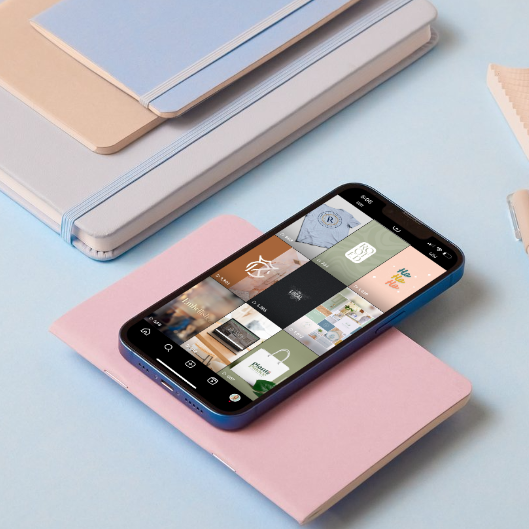
Explore my collection of branding and graphic design projects created to help businesses build memorable, meaningful identities. From strategy and logo design to color palettes, typography, and branded collateral, each project is thoughtfully designed to reflect the personality, values, and vision behind the business.
Previous Projects
Plant Palace


Plant Palace’s brand identity was created to honor the history of its 1930s post office building while capturing the variety and personality of the shop itself.
Drawing inspiration from the building’s historical charm, I developed a vintage stamp and “postage” brand icon to complement the primary logo. The color palette, made of greens, pinks, gold, and blue, was thoughtfully selected to balance elegance with an earthy, welcoming feel, reflecting the floral, gift, and service-focused nature of the business.


Kawonu Golf Club
Rooted in the history and natural beauty of Upstate South Carolina, Kawonu Golf Club’s visual identity was created to feel as timeless and distinctive as the property itself. Named for the ducks that have inhabited the club’s ponds and waterways for generations, the brand also draws from the land’s Cherokee heritage and the stories woven into its history.
A duck feather became the defining element of the logo, creating a meaningful symbol with a strong connection to place. Deep greens, sophisticated typography, and refined supporting elements establish a sense of tradition, confidence, and understated luxury, reflecting the exclusive character of the club while complementing its natural surroundings.
Willow Hill Soap Company


For Willow Hill Soap Company, the rebrand centered around creating a visual identity that felt natural, timeless, and deeply connected to the family behind the business.
The new identity included a refreshed logo and packaging system for the company’s line of soaps. A stylized willow tree was woven directly into the “Willow Hill” name, creating a recognizable mark that speaks to the brand’s name and natural roots. Classic serif typography adds an elevated, refined touch, resulting in packaging that feels both thoughtfully crafted and approachable.
Next Chapter Navigator


Warmth and reassurance were key considerations in developing the Next Chapter Navigator brand identity. Created for a business that helps families navigate important care decisions, the visual direction balances compassion and approachability with a sense of expertise and trust.
The centerpiece of the identity is a custom “N” icon inspired by the pages of an open book, representing guidance, knowledge, and the next chapter ahead. Paired with thoughtful typography and a calming color palette, the mark creates a distinctive visual presence while reinforcing the brand’s role as a trusted resource for families.
Gina Fox Realtor
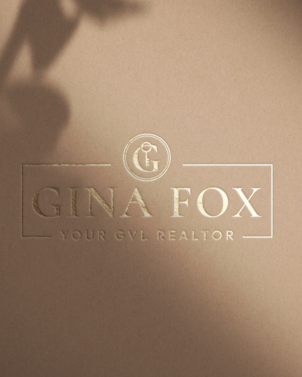


For Gina Fox, the goal was to create a brand that felt polished and professional while still capturing her warm, personal approach to real estate in Greenville, SC.
A custom G logo featuring an integrated key creates a memorable connection to both home and access, while maintaining an elevated, timeless feel. The color palette combines deep navy with earthy greens and teals for a sense of sophistication and calm, balanced by cream and gold accents that add warmth. A playful dotted-circle detail brings personality to the submark, creating a cohesive identity that complements the BHHS brand while giving Gina a distinct visual presence of her own.
The Greenville Spark


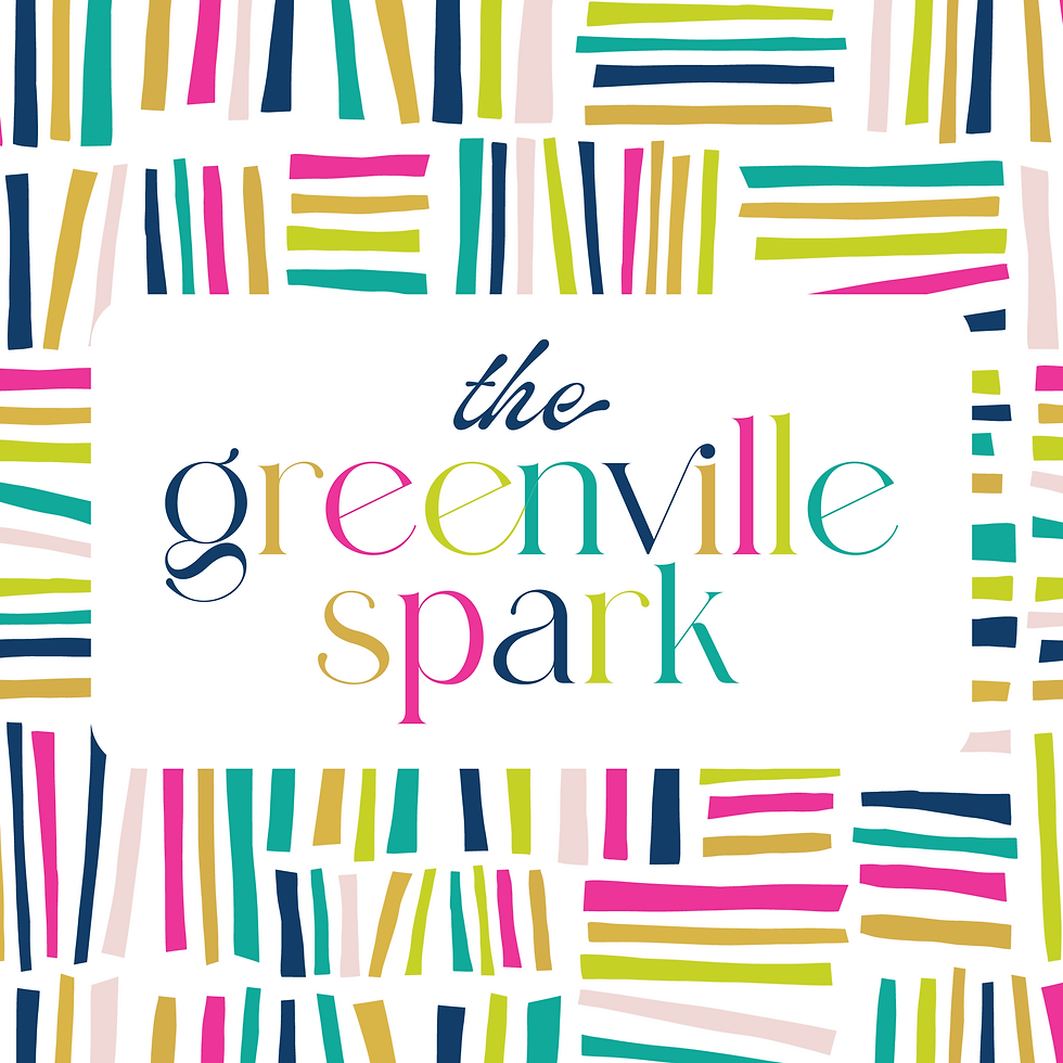
Bright, bold, and full of personality, The Greenville Spark identity was created to reflect the fun and memorable experience behind a permanent jewelry business in Greenville, SC.
The custom spark symbol gives the brand an instantly recognizable element that ties directly into its name, while a combination of decorative and sans serif typography adds contrast and visual energy. Vibrant colors further bring the identity to life, creating a look that feels playful and approachable while standing out in a crowded market.